

The Finder uses a number of graphic effects to reinforce behaviors. A third aspect of fixing the Finder makes it prettier, not by just adding fluff and eye candy, but employing intuitive user interface devices that make sense, enhance utility, and look good too. Here are some examples.
 Scratch the Ugly bits. To make way for a prettier and more functional Finder, we need to get rid of the ugly and inconsistent parts that fail to follow Apple’s own interface guidelines and are counterintuitive. Here are three things than need to go:
-
Kill the odd brushed metal look. It’s a painful flashback to that uncomfortable Post-Copland, Pre-OS X period, and it doesn’t even match Safari or the other metal apps. Take it behind the shed and... Blam!
-
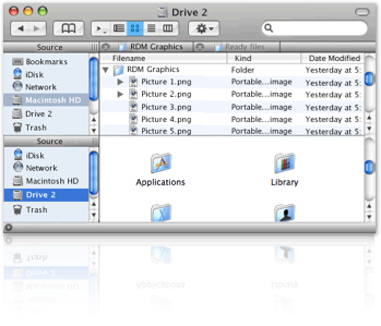
Lose the weird Sidebar behavior. Tiger’s Sidebar acts like the Dock, but it should act like an alias drop zone. A click on a Sidebar folder alias should take you to that location, but still allow you to backtrack into its enclosing folders. Also, deleting something from the Sidebar shouldn’t poof, it should act like a playlist deleted from iTunes. Similarly, an icon dragged from the Sidebar should do something useful, just like a title bar proxy icons.
-
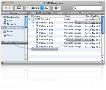
Take the Trash out of the Dock and put it in the Finder window Sidebar where it belongs. Not a moving target in the Dock, and not buried under windows on the desktop. Glad we got all that out of the way! Now for some additions:

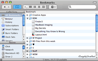
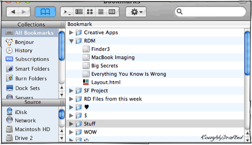
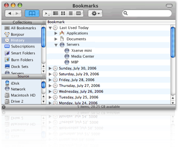
Finder Bookmarks would allow people to organize their files willy nilly into groups that made sense to them, without actually moving the files around. Users can already create folders of aliases, but Finder Bookmarks would simply organize them and make them available in a very simple interface which users already understand.
Finder bookmarks could be synced to .Mac just like Safari's web bookmarks. This doesn't employ any new technology, as the system already knows how to create and manage aliases and links to files, directories, and file servers.
Remember that when Safari arrived, there was nothing new about bookmarks either. The problem was that nobody used them because bookmarks were presented poorly. Safari’s bookmark organization page fixed all that. Safari's simple, obvious organization is one click away, and there is literally nothing to learn.
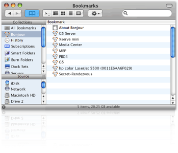
The Finder Bookmark view would also be one click away. Organize links to various servers, create groups of applications, or pull together aliases of files to create a folder of links representing a project, or grouped by topic.
Smart Folders already create live collections of links based on search rules; a Bookmark view would provide a way to define a large number of smart folders that were out of the way, but easy to access.
Windows users have always been forced to use a Program Manager that is separate from Explorer, the Windows file manager, because the file organization on a DOS machine is so arcane, fragile, and cryptic that an entirely different interface was needed to present a list of programs that an end user could be expected to navigate. The Program Manager turned into the Start menu, which remains as a listing of pointers to the actual programs installed.
Those shortcut pointers are dumb links though; remove an application, and ghost links stick around in the Start Menu's program list. If a Start Menu's listing gets deleted, it doesn't do anything to the actual app, but users will have a tough time figuring out how to get it back.
My idea for Finder Bookmarks would create a similar clean listings of aliases to files, directories, and servers, but would link closely to the actual file system, so users wouldn't be lost. Arrow links could point to a bookmark's actual location just like iTunes arrows point songs to the iTMS. Bookmarks would serve some other purposes as well:
-
•It expands upon the Dock as a launcher, allowing a place to store interchangeable sets of Docks;
-
•It provides a place for shelving occasionally used Smart Folders and Burn Folders;
-
•Provides an extended history of recently used files, applications, and servers;
-
•Provides an interface to introduce RSS based file subscriptions. This would allow users in an office to publish a file using an RSS feed, and every time the file was updated, users would get notified and be able to download the newest version.

A Finder Status Bar, when enabled, would show a file’s path in the lower line of the Finder window, just like Safari can show the URL of the current link.
Finder preferences could select what else else was displayed: select file info, Smart Label, or other status information useful to the user, as a rapid feedback when the user hovers over files.
Tabbed windows are an obvious thing to add; several people have mocked up nice looking examples. The Finder really needs better tabs than Safari's however.
That's why I'm holding out for Final Cut Pro style draggable tabs. Rather than simply allow multiple tabs within a window, draggable tabs allow users to drag a tab out of a window to create a new Finder window.
Multiple windows can also be dragged into a single Finder window to create one window with multiple tabs. Adobe apps have long used draggable tabs for toolbar windows, as do Apple's own Pro Apps. This interface is too smart not to be in the Finder. It’s a very intuitive way to work. Don’t like it? Turn it off!
Excel style multiple pane views add another wrinkle to tabs. Multiple panes provide a view of the contents of multiple tabs at once, side by side. This would make it easy to handle, for example, ongoing copy operations:
-
•Open Finder windows of a source and destination
-
•Drag them together to make a tabbed Finder window
-
•Drag a pane down to split the window to show both views at once.
With both locations locked into a single window, it's easy to copy and paste between the two locations, leave to do other work, move files around, and then instantly return to the setup view to do additional updates. This type of multiple view Finder window would also be handy for automated folder comparisons that worked like FileMerge.
Add Prettier Finder Windows that use the solid Unified look of iLife apps. Present File Previews and Finder icons like iTunes album art, so it is obvious to users that they can assign their documents custom icons. Make it easy to batch assign file previews as file icons. Put a window size control on both the lower corners of the window.
Enable functional Finder windows in file dialogs. Application save and open file dialogs should allow users to move, copy, rename and do other simple tasks without stopping to open the Finder.
Similarly, an open file dialog should allow users to modify their sidebar icons, and should display Finder toolbar icons; currently, both shortcut methods are locked or unavailable outside of actual Finder windows. There is no reason why these features should not be available everywhere.
Custom file view selectors, suggested by Qwerty Denzel, allow users to create defined sets of View Options that can be applied to the existing folder view manually, like a Print Preset. The Finder could also intelligently apply a specific view option set based on a folder's contents or by its location in the filesystem. Some examples:
-
•Images: icon view, icon size 256, icon preview and item info enabled, arranged by date modified, gray background;
-
•Detail: list view, icon size 16, all columns shown except label and comment, calculate size, arranged by name;
-
•Browser: icon view, icon size 48; arranged by name;
-
•Backup: list view, show size and version columns, arrange by date modified, show path in status bar;
-
•Column Browser: column view, show icons, automatically size width to fit;
-
•Slow Network: column view, no icons.
Smart Labels, introduced earlier, would expand labels beyond being just a simple color tag into a rich, user selected set of file attributes, permissions settings, and metadata tags that could be applied to a large selection of files.
Of course, there is that one other thing I like to mention: The Finder Store. It’s an easy to use marketplace to buy software, ink and toner, cables, RAM, and everything else, all tied into the Finder. It keeps a record of your purchase history, tracks rebates and warrantees for you, and generates printable reports.
In describing ideas for the Finder and Leopard, I keep running into a wall of features I think Apple should offer, but which runs into conflict with the simplicity Apple has to offer. It’s the One Button Mouse Syndrome. I’m a firm believer in consistent, simple interfaces, but Apple needs to also target advanced users. I’ll discuss how this can work in an upcoming article.

| | Comment Preview
 Read more about:
 Send |

 Subscribe |
 Del.icio.us |
 Digg |
 Furl |
 Reddit |
 Technorati
Click one of the links above to display related articles on this page.
How to Fix the Finder 3: Prettier
Tuesday, August 1, 2006